
Instagram Sizing Guide 2026: Everything You Need to Know About the New Grid
Instagram Sizing Guide 2026: Every Dimension and the New 3:4 Grid
If you have been designing every post at 1080 x 1080, your grid is quietly working against you. Instagram retired the square grid in 2025, and in 2026 it went a step further by accepting a taller upload size natively. The templates most teams have used for years now get cropped or padded the moment they go live.
This guide gives you the exact pixel dimensions for every Instagram format in 2026: feed posts, carousels, Stories, Reels, and profile photos. We run social across multiple markets and multiple accounts, so we have rebuilt our own templates around these specs. Here is what changed, what to design at now, and the one detail about ads that trips up most brands.
What Is the New Instagram Grid Size in 2026?
Instagram’s profile grid now previews every post at a 3:4 vertical ratio, not the old 1:1 square. This change was announced by Instagram head Adam Mosseri in 2025, and it applies to every thumbnail on your profile regardless of the ratio you originally uploaded.
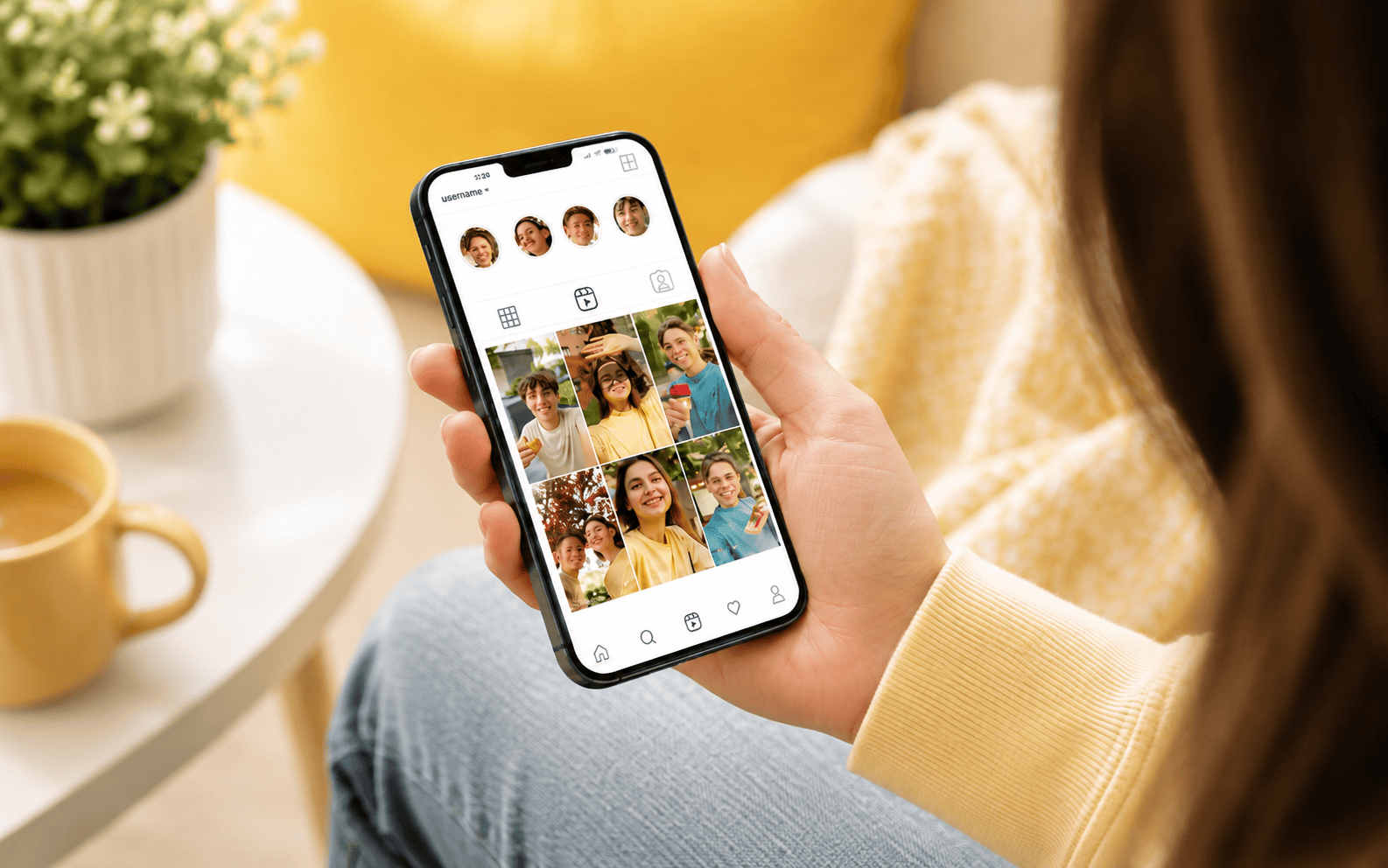
The knock-on effect is simple. A square post gets padded or cropped on the grid, a 4:5 portrait post loses a thin strip from the top and bottom, and anything taller than 3:4 gets trimmed hard. According to Oktopost’s 2026 grid size guide (2026), every thumbnail is cropped to 3:4 regardless of the original aspect ratio, which is why one dimension can no longer look good everywhere.
The bigger update came in 2026. Instagram added 3:4 (1080 x 1440 px) as a native feed upload size. That means a 3:4 post now fills both the feed and the profile grid with zero crop, which was not possible when the grid change first rolled out.
What Is the Best Instagram Post Size in 2026?
The best all-purpose Instagram feed post size in 2026 is 1080 x 1350 pixels (4:5 portrait). It takes up the most feed space of any ad-eligible format, and it holds up well under the 3:4 grid crop when you keep key elements centered.
There is a second option worth knowing. According to multiple 2026 size guides, 1080 x 1440 (3:4) is the only format that fills both the feed and the grid with no cropping at all, because it matches the grid preview exactly. The trade-off is that 3:4 cannot be promoted as a paid ad, which we will come back to.
Here is the full breakdown of every current feed format.
| Format | Size (pixels) | Aspect Ratio | Best For |
|---|---|---|---|
| Portrait (recommended) | 1080 x 1350 | 4:5 | Default feed post, ad-eligible, maximum feed height |
| Tall portrait (new) | 1080 x 1440 | 3:4 | Zero grid crop, organic only, cannot be run as an ad |
| Square (legacy) | 1080 x 1080 | 1:1 | Cross-platform reuse, gets padded on the grid |
| Landscape | 1080 x 566 | 1.91:1 | Rarely recommended, loses grid area on both sides |
Should You Upload at 4:5 or 3:4?
Upload at 4:5 (1080 x 1350) if you ever boost posts or run paid promotion, and upload at 3:4 (1080 x 1440) only when a perfectly uncropped grid matters more than ad flexibility. This is the single most useful decision to get right, and most guides skip past it.
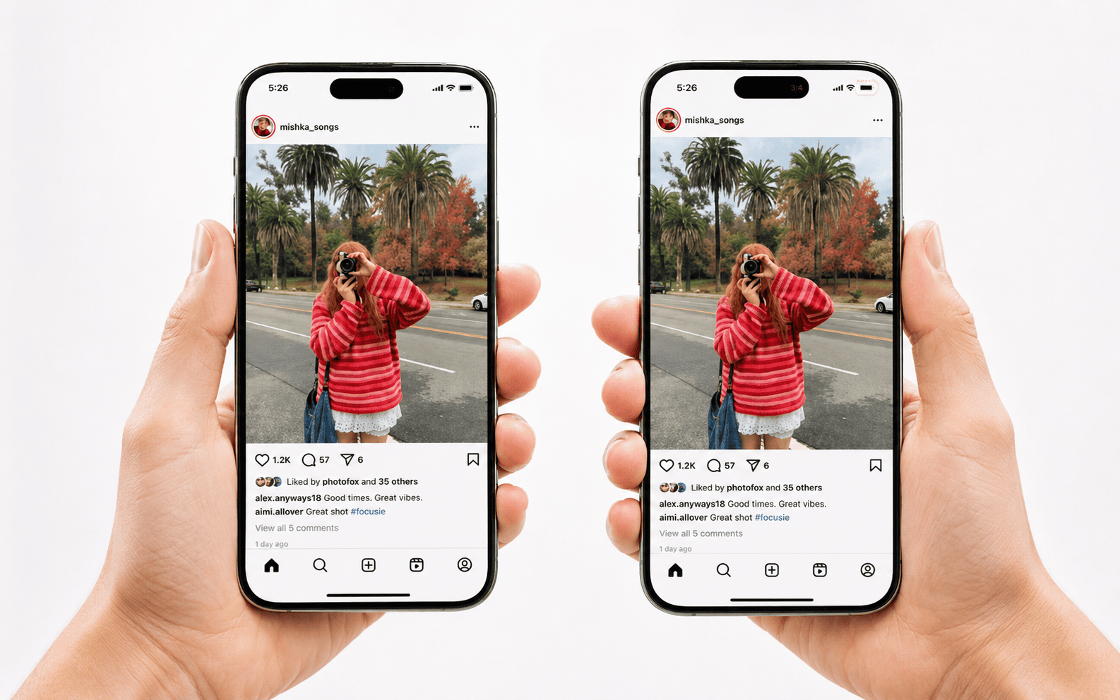
The reason comes down to Meta’s ad system. According to Ordinal’s 2026 Instagram size analysis, the 3:4 ratio is not supported for paid promotion, so a 3:4 post will be rejected at the ads manager stage. The 4:5 format is the only portrait size that stays ad-eligible.
Our working rule is straightforward. Design at 4:5 as the default, since it keeps every post promotable, and reserve 3:4 for organic-only content where a flawless grid is the priority, such as a brand launch or a pinned row. If you are managing paid and organic together, standardizing on 4:5 avoids re-exporting assets later.
What Size Should Instagram Stories and Reels Be?
Instagram Stories and Reels are both 1080 x 1920 pixels at a 9:16 aspect ratio. This vertical, full-screen format is the same for both, and using matching dimensions for a Reel and its cover keeps everything aligned on your profile.
Safe zones matter more here than anywhere else, because the interface covers part of the screen. According to PixExact’s 2026 safe zone guidance, the top 14% of a Story holds the username and menu buttons, and the bottom 21% holds the caption and action buttons. Keep text, logos, and calls-to-action inside the centre zone so nothing critical gets hidden.
One note on Reels covers. The cover uploads at the same 9:16 ratio, but the profile grid shows only a centre-cropped 3:4 slice of it. If your Reel cover has a title or a face near the edge, it can get chopped on the grid, so centre the key part of the cover.

What Are the Correct Instagram Carousel Dimensions?
Instagram carousels should use one consistent aspect ratio across every slide, and 1080 x 1350 (4:5) or 1080 x 1440 (3:4) are the two vertical options that perform best. The first slide sets the ratio, and Instagram auto-crops every other slide to match it.
Carousels earn their place in a content plan. According to PixExact’s 2026 algorithm breakdown, carousel posts now receive roughly 1.4 times more reach than single images, which makes getting the slide sizing right worth the extra minute.
The practical workflow is to crop all slides to the same ratio before uploading, rather than letting Instagram trim them for you. Carousels support up to 20 slides in 2026, and you can reorder or replace slides after posting, though you still cannot change their size once published.
What Size Should Your Instagram Profile Picture Be?
Upload your Instagram profile picture at 320 x 320 pixels or larger, at a 1:1 square ratio. Instagram displays it as a small circle, so centre your logo or face and avoid text, which is rarely legible at that size.
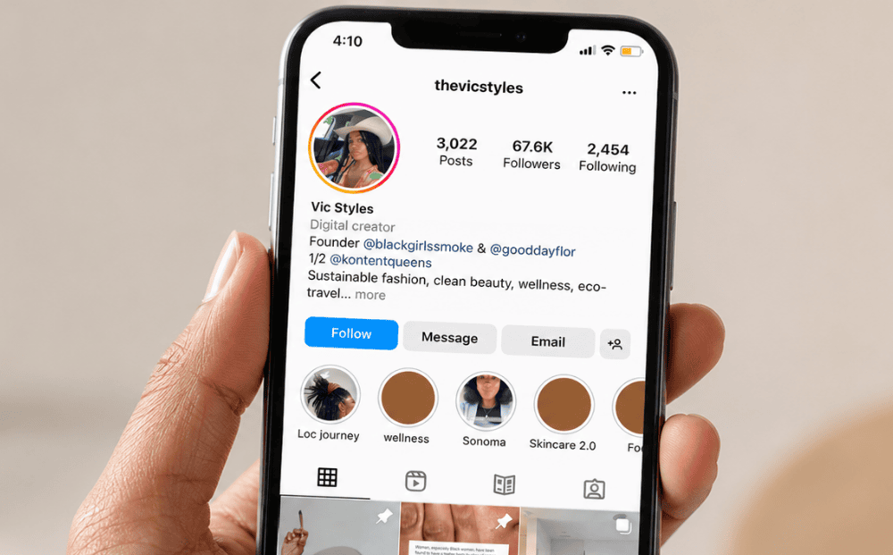
For a business account, this is a small detail with outsized weight. The profile photo, the grid, and the first three rows of posts are what a prospect judges in the first few seconds of landing on your page. A cohesive grid signals that a brand is active and intentional, which is part of why we treat profile consistency as a real deliverable in our social media marketing work, not an afterthought.
How Do You Stop Your Posts Getting Cropped on the Grid?
Design inside a 3:4 safe zone. Keep faces, text, and logos within the central 3:4 area of your canvas, and the grid crop will never cut anything important, no matter which upload ratio you choose.
The most reliable habit is to pick one primary ratio and hold to it for most of your posts. According to Oktopost (2026), mixing square, portrait, landscape, and Reel covers without a plan creates a chaotic grid, and choosing one format for at least 80% of posts keeps rows aligned.
A few checks prevent almost every cropping problem:
- Standardize on 4:5 (1080 x 1350) for ad flexibility, or 3:4 (1080 x 1440) for a zero-crop grid.
- Keep critical elements inside the centre 70% of the frame.
- Upload at 1080 px wide. Smaller uploads look blurry, and larger ones get compressed anyway.
- Use JPG for photos and PNG for graphics with text or sharp lines.
- Plan carousel and grid rows in batches of three to keep the profile aligned.
Getting dimensions right is the floor, not the ceiling. It stops your content from looking broken, but a grid that actually converts profile visitors into followers comes from a consistent visual system, which is where template design and a real content plan do the heavy lifting. For brands running social across several markets, that consistency is harder than it looks, and it is a large part of what a social media marketing partner is for.
Why Does Instagram Sizing Now Affect Your Search Visibility?
Instagram content is now indexed by Google, so the quality and consistency of your grid can feed into how your brand shows up in search, not just on the app. Since mid-2025, public Instagram posts and Reels have been eligible to surface in Google results, which turns a well-kept profile into a discoverability asset rather than a closed silo.

This matters more in 2026 than most brands realize. According to Buffer’s 2026 Instagram size guide, keeping content inside the 3:4 safe zone protects how posts render across the feed and grid, and that same visual consistency is what makes a profile look credible when it appears in a search result or an AI-generated answer.
The practical takeaway is that sizing, brand consistency, and search visibility are no longer separate workstreams. A messy grid weakens the brand signal that increasingly influences both social discovery and search. This is why we fold Instagram consistency into the broader picture of how brands get discovered in AI and search, and why our writing on social media strategy across Asian markets treats platform mechanics and brand building as one system.
If you are managing Instagram across multiple markets or accounts and want a team to build the templates and the system that keeps your grid consistent, the Creative For More team can help. Book a discovery call to explore how we can support your brand’s growth.

Geraldine Pang
Creative For More
Geraldine Pang is the founder of Creative For More, a cross-border digital marketing agency with offices in Singapore, Tokyo, and New York. She specializes in brand strategy, market entry, and cross-border marketing across Southeast Asia, Japan, and the United States.