
Japanese Website Design: What Foreign Brands Should Know Before Building for Japan
Japanese Website Design: What Foreign Brands Should Know Before Building for Japan
Japanese website design favors information density, visible trust signals and careful typography over the sparse layouts common in Western markets. A site built for Japan usually needs detailed product and pricing information on the page, a full company profile, Japanese web fonts that load quickly, and mobile layouts that still work well on desktop, which carried 51.83% of Japanese web traffic in September 2026.
Many foreign brands arrive in Japan with a website that was designed for another market and translated afterwards. The translation may be accurate, but the page often feels thin to Japanese users because it omits the detail, reassurance and company context they expect before contacting a business or buying.
This guide covers the design decisions that matter most when a brand builds or adapts a website for Japanese users. It sits within our wider international website development guide, which covers structure, platforms and localization across markets.
Why Do Japanese Websites Look So Different?
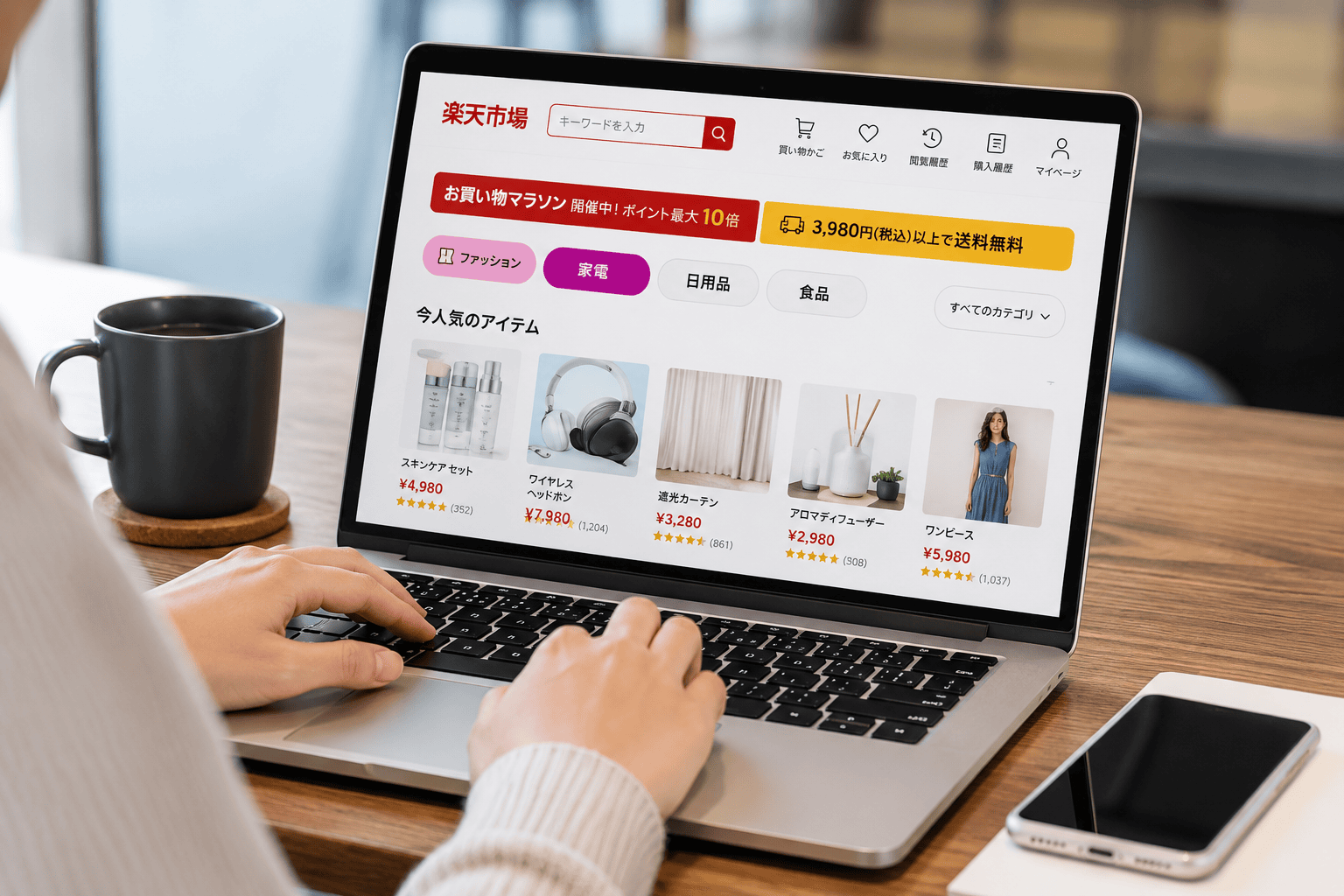
Japanese websites often look dense because Japanese users tend to expect complete information before they act, and because the Japanese writing system packs more meaning into less space. A page that shows specifications, prices, conditions and contact routes at once reduces the uncertainty a user would otherwise resolve by calling or emailing.
The writing system is part of the explanation. Japanese mixes kanji, hiragana and katakana, and each character occupies a square frame, as described in the W3C Requirements for Japanese Text Layout. A single line of Japanese can carry what takes two lines in English, so a dense Japanese page doesn’t always hold more words than a sparse English one.
Density is not universal, though. Premium, craft and luxury brands in Japan frequently use generous white space, restrained color and slow visual pacing. Retail, comparison, finance and public-sector sites sit at the dense end, while hospitality and fashion often sit at the quiet end.
How Much Information Should a Japanese Website Show?
A Japanese website should show enough information for a user to make a decision without leaving the page. In practice that means full specifications, pricing with tax treatment, delivery or service conditions, and a clear route to ask a question.
The useful question for a brand is not “dense or minimal?” but “what does a Japanese buyer in this category need to see before they trust us?” A B2B software company may need detailed feature tables, security information and implementation steps. A skincare brand may need full ingredient lists, usage instructions and notes on who the product suits.
A clean visual style and a high level of detail can coexist. Clear headings, tables, tabs and accordions let a page carry more information without looking cluttered.
What Trust Signals Do Japanese Users Expect?
Japanese users expect a website to show who the company is, where it operates and how to reach it. A detailed company profile page, a physical address, a phone number and recognized certifications are standard trust signals in Japan, and their absence is noticed.
The company profile page, known as 会社概要 (kaisha gaiyou), is a standard page on Japanese corporate sites. It typically lists the registered company name, date of establishment, representative director, capital, address, business activities and main banks or partners. Foreign brands often leave this page out because their home-market site doesn’t have one.
Certifications also carry weight. The PrivacyMark system, operated by JIPDEC, certifies businesses that handle personal information appropriately, and its site reports that more than 17,700 companies hold the mark. A brand that holds PrivacyMark, ISO certification or industry awards usually displays them prominently.
| Trust signal | What Japanese users look for | Common gap on foreign brand sites |
|---|---|---|
| Company profile (会社概要) | Registered name, founding date, representative, capital, address | Page missing or limited to an “About us” story |
| Local contact details | Japanese address, phone number, business hours in JST | Only an overseas address or a contact form |
| Certifications | PrivacyMark, ISO, industry memberships | Not shown, or shown only in English |
| Japanese-language support | A named Japanese contact route for enquiries | English-only support with no stated response time |
| Detailed FAQ | Answers to delivery, returns, contract and usage questions | Short FAQ written for another market |
Which Fonts Work Best for Japanese Websites?
Most Japanese websites use a gothic (sans-serif) typeface for body text and interface elements, with mincho (serif) faces used more for editorial, premium or traditional brands. Noto Sans JP, available free through Google Fonts, is a common choice because it covers the full character set and renders consistently across devices.
Japanese fonts are large files because they contain thousands of characters. According to Google Developers (2018), Google Fonts splits Japanese fonts into slices so browsers download only the characters a page needs, which cut the data downloaded by 80% compared with sending the whole font. Self-hosting a full Japanese font without subsetting is a frequent cause of slow pages.
Typography also involves line-breaking and spacing rules. Japanese text should not begin a line with certain punctuation marks or small kana, and these rules are handled by the CSS line-break property and correct language tagging. Setting lang=”ja” on Japanese pages helps browsers apply the right font fallback and line-breaking behavior.
How Do Japanese Users Browse: Mobile or Desktop?

Japanese users browse on both mobile and desktop in roughly equal measure, so neither layout can be treated as secondary. According to StatCounter (September 2026), desktop accounted for 51.83% of web traffic in Japan, mobile for 45.78% and tablet for 2.39%.
On mobile, iPhone dominates. StatCounter data for the same month shows iOS at 60.51% of mobile operating system share in Japan, against 39.49% for Android, so Safari rendering deserves particular attention during testing. Desktop layouts still matter for B2B buyers, who often research suppliers from office computers.
Connection speeds are fast but not a reason to ignore page weight. According to DataReportal (Digital 2026: Japan), median mobile download speeds reached 60.37 Mbps in the twelve months to August 2025, and 87.0% of the population used the internet. Heavy image carousels and unsubsetted fonts still slow pages noticeably on mobile connections.
How Should Foreign Brands Avoid Stereotyped Japanese Design?
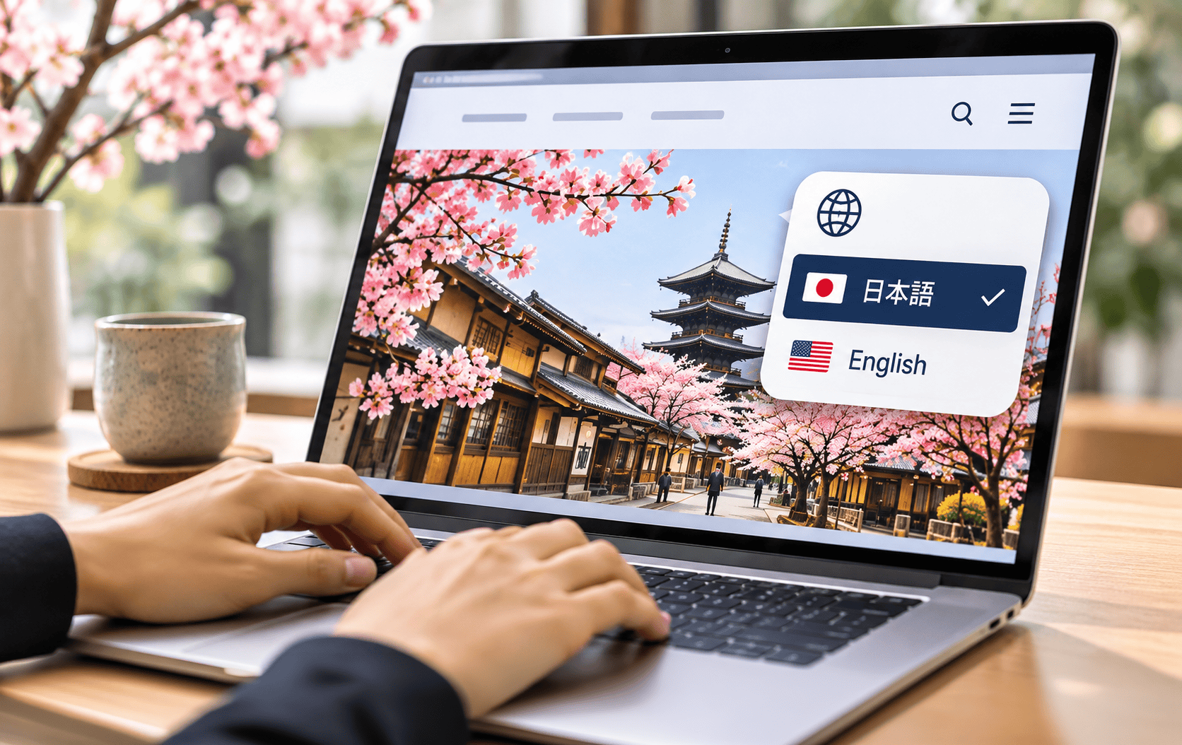
Foreign brands should design for Japanese user expectations rather than for a visual idea of “Japan.” Cherry blossoms, red circles and brush-stroke fonts rarely improve a site and often read as a tourist’s view of the country.
The more useful work is structural. It includes writing the company profile, adding the detail Japanese buyers ask for, choosing appropriate fonts and testing on iPhone Safari. A brand’s existing visual identity can usually stay intact while the information architecture and copy are adapted.
Copy register matters as much as layout. Japanese business writing uses levels of politeness that change how instructions, error messages and calls to action read, and a direct translation of casual English can come across as abrupt. Our Japan go-to-market team works with Japanese account managers in Tokyo, who review tone and structure on Japanese-facing pages before launch.
What Should a Japanese Website Checklist Include?
A Japanese website should cover structure, content, trust and performance before launch. The list below reflects the design issues that come up most often when a foreign brand adapts an existing site for Japan.
- A dedicated Japanese version of each key page, not a machine-translated overlay.
- A company profile page (会社概要) with registered details and a Japanese contact route.
- Full product or service detail, with pricing that states tax treatment.
- Gothic or mincho web fonts that are subset or served in slices.
- The lang=”ja” attribute and correct line-breaking on Japanese pages.
- Testing on iPhone Safari and on desktop browsers.
- Visible certifications, awards and client logos where they exist.
- Copy reviewed by a native Japanese speaker for register and tone.
Creative For More builds multi-language WordPress and Shopify sites from offices in Singapore, Tokyo and New York, and our web design and development work includes Japanese-language builds, localization and international SEO in one project.
If you’re preparing a website for Japanese users and want it designed around how they research and buy, our Tokyo and Singapore teams can scope it with you. If your company is looking for a strategic marketing partner, the Creative For More team can help. Book a discovery call to explore how we can support your brand’s growth.
Read More
- International Website Development: The 2026 Guide for Multi-Market Brands
- Japanese Marketing Strategy: What Global Brands Should Know to Succeed in Japan
- Marketing to Japan: Navigating Consumer Preferences and Cultural Nuances
- Even Native Speakers Study Keigo: What That Tells Us About Communication Standards in Japan
- How to Start Selling Online in Japan: A Step-by-Step Guide for Global Brands

Geraldine Pang
Creative For More
Geraldine Pang is the founder of Creative For More, a cross-border digital marketing agency with offices in Singapore, Tokyo, and New York. She specializes in brand strategy, market entry, and cross-border marketing across Southeast Asia, Japan, and the United States.